The brief: a clear doorway into the services
The homepage introduces the agency in one screen. A large, whole Earth is the focal point; the Services link and Enter the galaxy action lead into the interactive catalogue. The brief called for this composition to work on desktop and mobile without turning the homepage into a long scroll page.
The catalogue carries eight service lines and 28 offerings. A visitor can explore the planets, read service information and reach pricing, industry and contact details through the same galaxy.
Before: the Earth did not carry the composition
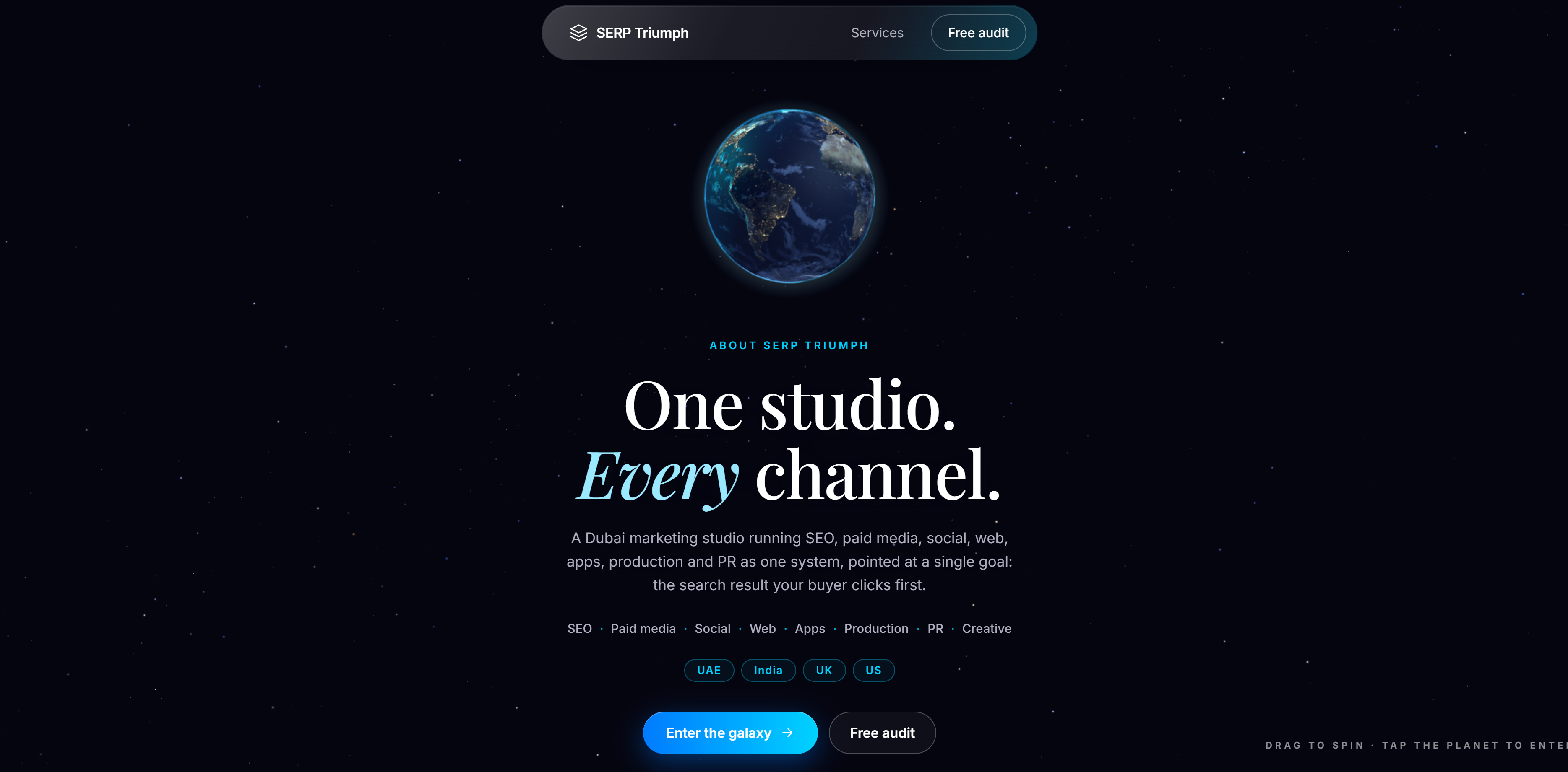
The screenshot made the issue clear: the globe was present, but its size did not give it the intended role in the page. The interaction also needed a clear drag target so movement on the planet did not become text selection.
What changed
- A larger Earth. The desktop composition gives the globe the free space beside the agency introduction. On a phone, the globe sits above the readable copy.
- Drag ownership. Planet interactions capture the active pointer and distinguish a drag from a tap, with cleanup when the interaction is cancelled.
- A real services destination. The galaxy route contains the interactive catalogue rather than a redirect back to the homepage.
- Readable recovery. Service information remains available when the browser cannot run the main WebGL experience.
- Direct service content. Ordinary HTML pages explain each service without requiring a visitor to select a planet first.
After: the globe has a clear role
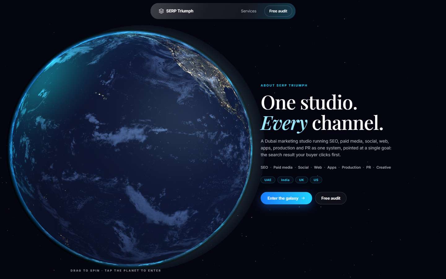
The work keeps the visual concept and connects it to a practical information path. The homepage introduces the agency, the galaxy lets people explore the catalogue, and service pages provide direct explanations and relevant contact actions.
What was checked
The project verification covered build output, real route responses, local asset references, globe framing, pointer interaction and recovery behavior. Publication checks compared deployed file bytes with the approved package. These checks establish specific delivery behavior.
This is a first-party website delivery case. It does not present an external client campaign, a traffic increase, a ranking gain or a revenue result. Those outcomes require later search, analytics and business evidence.
Apply the same thinking to your website
Start with the visitor action, the information the page needs to provide and the devices people use. An interactive design can remain distinctive while its core content and enquiry route stay accessible.